I was tasked with creating a promotional website prototype that informs users with useful information about a particular product. In addition to this, I was required to use 20 interface design principles and laws.
I was tasked with creating a promotional website prototype that informs users with useful information about a particular product. In addition to this, I was required to use 20 interface design principles and laws.
My goal for this project was to design a website that showcases Apple’s AirPods lineup while highlighting the key features of each model. In addition, I wanted the site to be easy to navigate and logically organized so users can quickly compare the three AirPods models. To accomplish this, I applied the 20 interface design principles while keeping the same minimalist look as Apple’s website.
For my project proposal, I outlined a website that would showcase Apple’s AirPods lineup, highlight the main features of each model, and make it easy for users to compare all three. I also explained how I would incorporate each of the 20 interface design principles to effectivily design my site to acheive my goal.
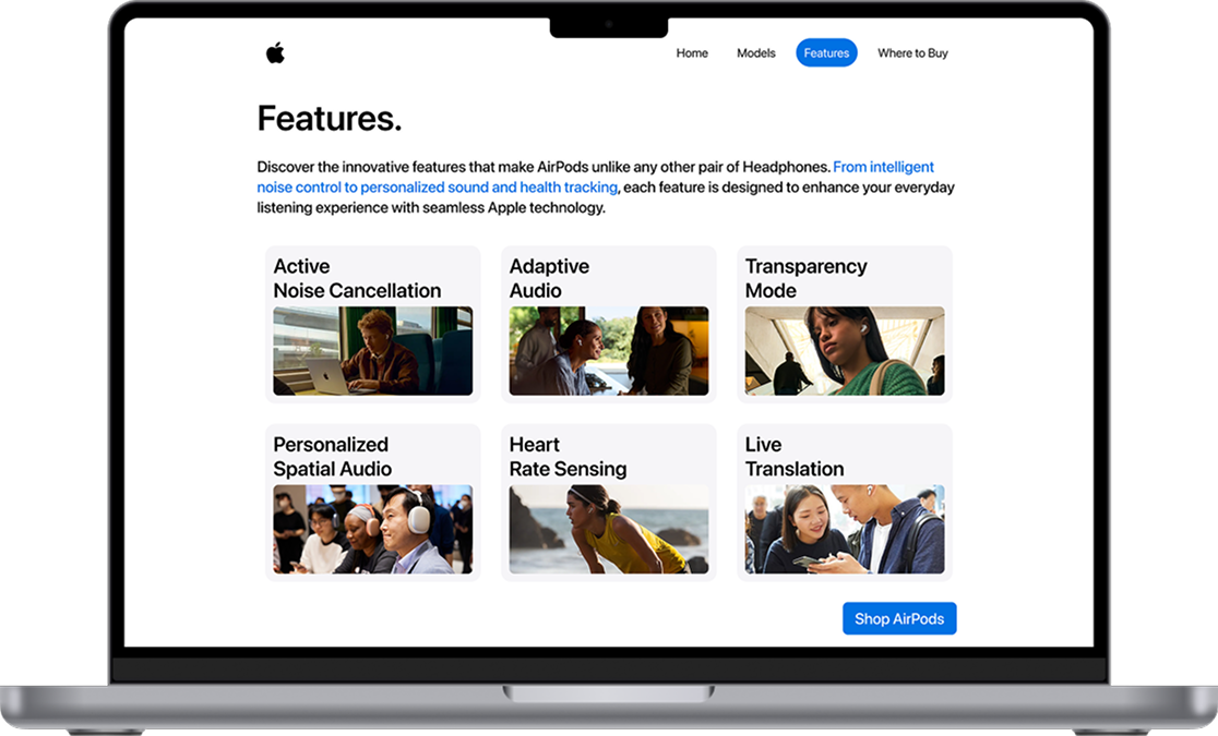
Miller's Law suggests that the average person can process 7 (plus or minus 2) pieces of information in their Working Memory. An example of this in my prototype is how the user only has to go through 6 features on the features page.
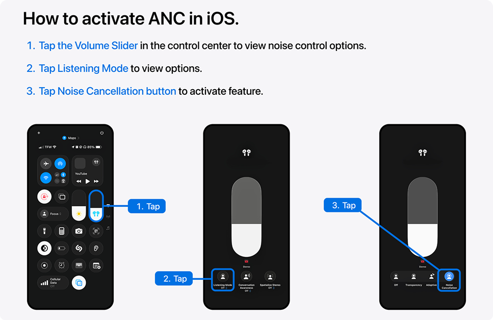
The Zeigarnik Effect states that people are more likely to remember unfinished tasks than completed tasks. I considered this concept in my prototype by including a carousel indicator at the bottom of the tutorial portions.

The Multimedia Principle states that people learn better with a combination of graphics and text than from text alone. I applied this principle to my prototype by including related images below the text explainations.
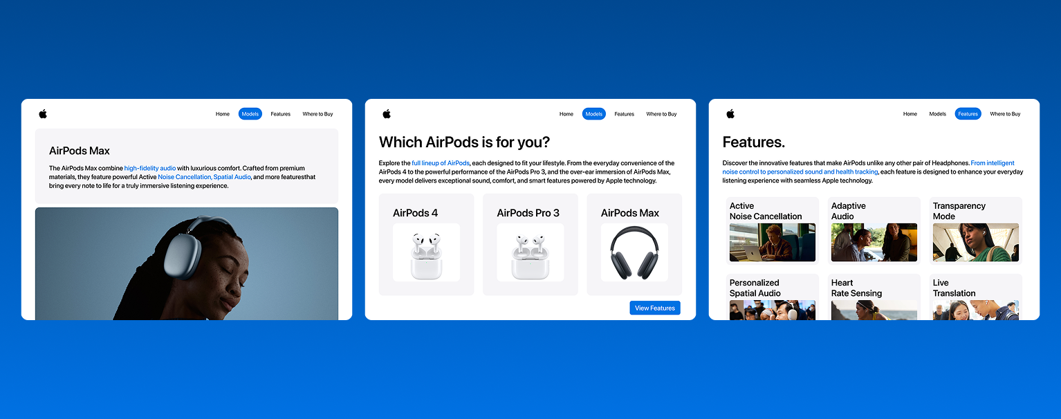
This is my final prototype, a promotional website for Apple’s AirPods that highlights the main features of each model, compares them side by side, and that informs users on where to buy them. The site is designed to be easy to navigate, visually clean, and organized, all while using the 20 interface design principles in addition keeping Apple’s minimalist style.
Throughout this project, I learned a lot about the interface design process. For example, I learned how interactive designers plan and organize information to make websites easy to use, how they balance visuals with functionality, and how they consider the user’s experience using the same design principles I've learned. Overall, I am excited to venture further into this field while continuing to apply these concepts to my future projects.